University of Wisconsin Course Search and Enrollment

Author: Tyler Johnston
Tools: JavaScript HTML/CSS React/React-Bootstrap Figma
Date Posted: 02/23/2022

Overview

As an introduction to React, University of Wisconsin's UX/UI design course had us develop a course search and enroll web application. Over a span of four weeks, the application went through four iterations.

See collapsed sections for demo videos, github repos, and project details.

Live Demos:

(Note: These web applications were not built to accomodate mobile screens.)


Week 01: Course Search and Enroll

Week 01: Course Search and Enroll

Live Demo / GitHub Repo

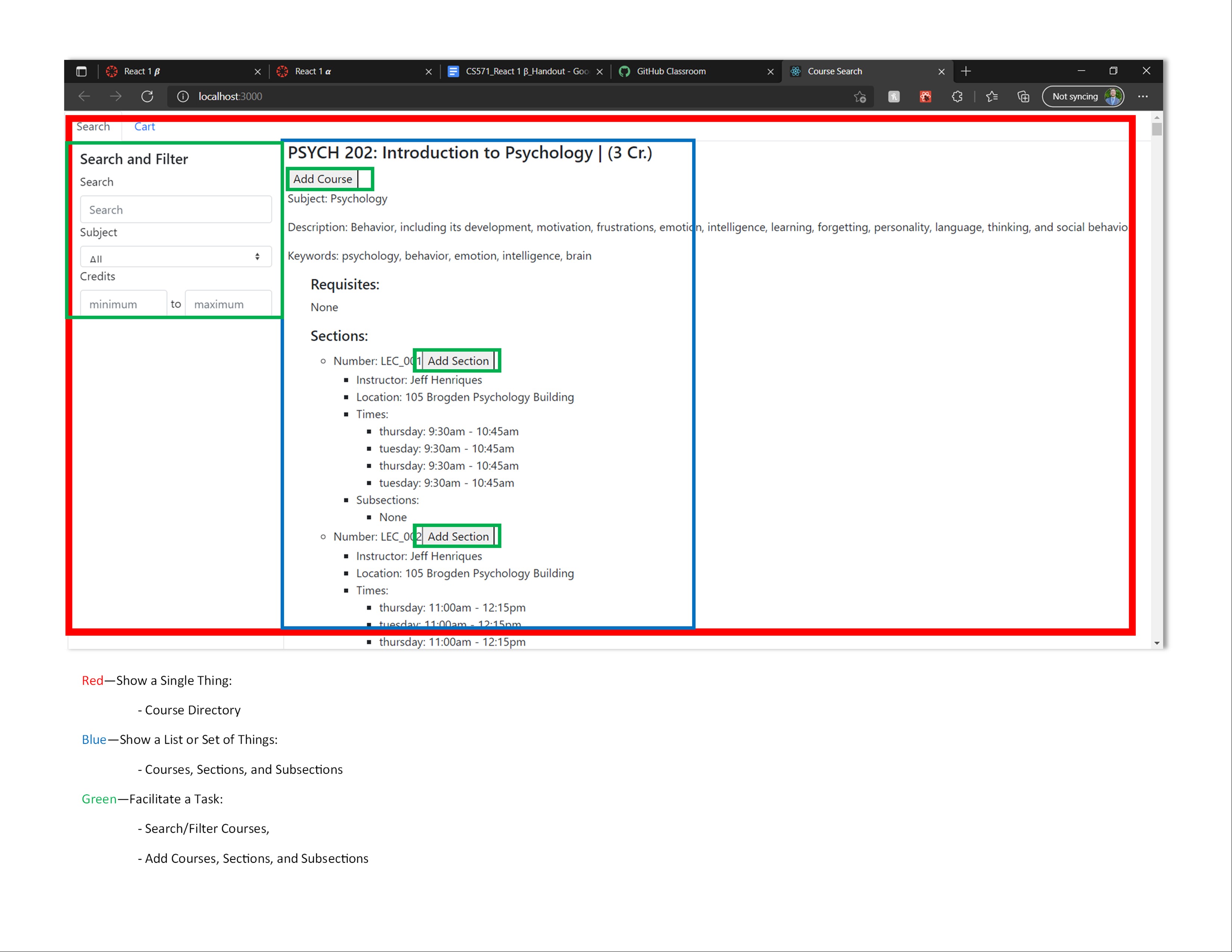
This assignment is meant to introduce more features of JavaScript, along with showing how a React project works. Additionally, this will introduce different features of React, e.g. states, props, more modularized components etc.

This project is the first of a two part React project in which the course management application is extended. This application uses a limited quantity of modified data from the UW Madison course information database.

Features Implemented
  • Display all course content for each course fetched from API
  • Search and filter functionality, allowing the user to search by keyword or filter by credits or subject.
  • Add or remove course from cart
  • View courses in cart.

For more information, see a full writeup of assignment deliverables.

Week 02: Analysis, Wireframes, and Redesign

Week 02: Analysis, Wireframes, and Redesign

Live Demo / GitHub Repo

Section Summary
  • In this section, the goal was to analyze our pre-existing course search and enrollment application, with the goal of finding room for improvement in its design.

  • After the analysis, the goal was to construct wireframes for a redesign. This was to be done using a design software (such as FIGMA.)

  • Once the wireframes were completed, it was time to refine the details of the redesign (i.e. selecting a color palette, icons, and fonts)

  • The final step was meant to be the creation of a mockup for our redesign. Instead, I chose to try implementing the redesign, including a revamp of my React component hierarchy.

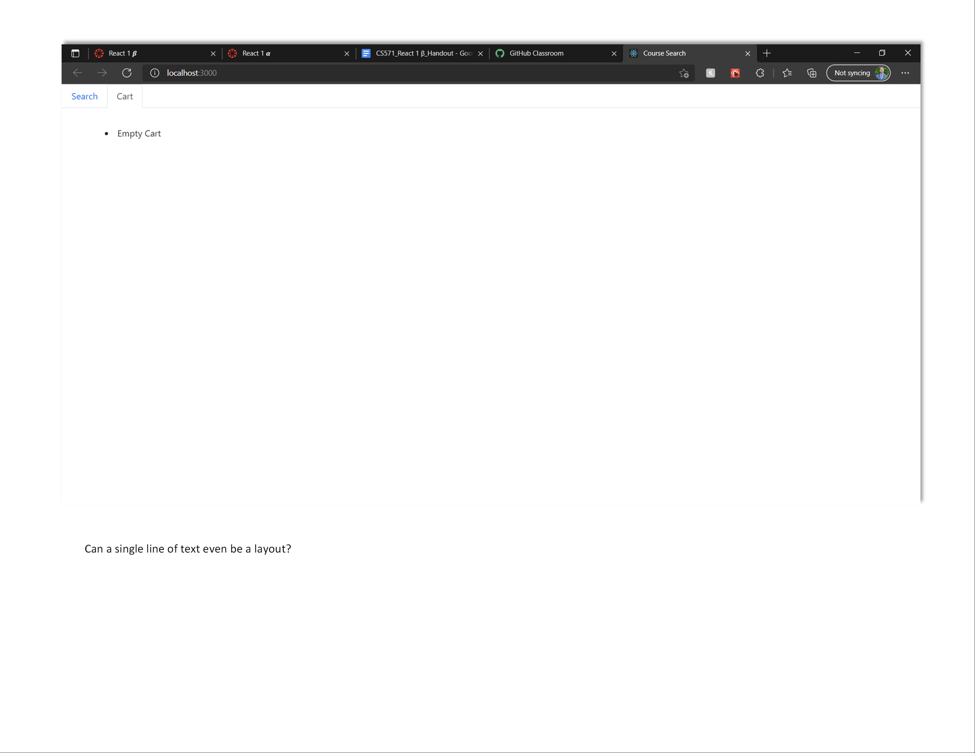
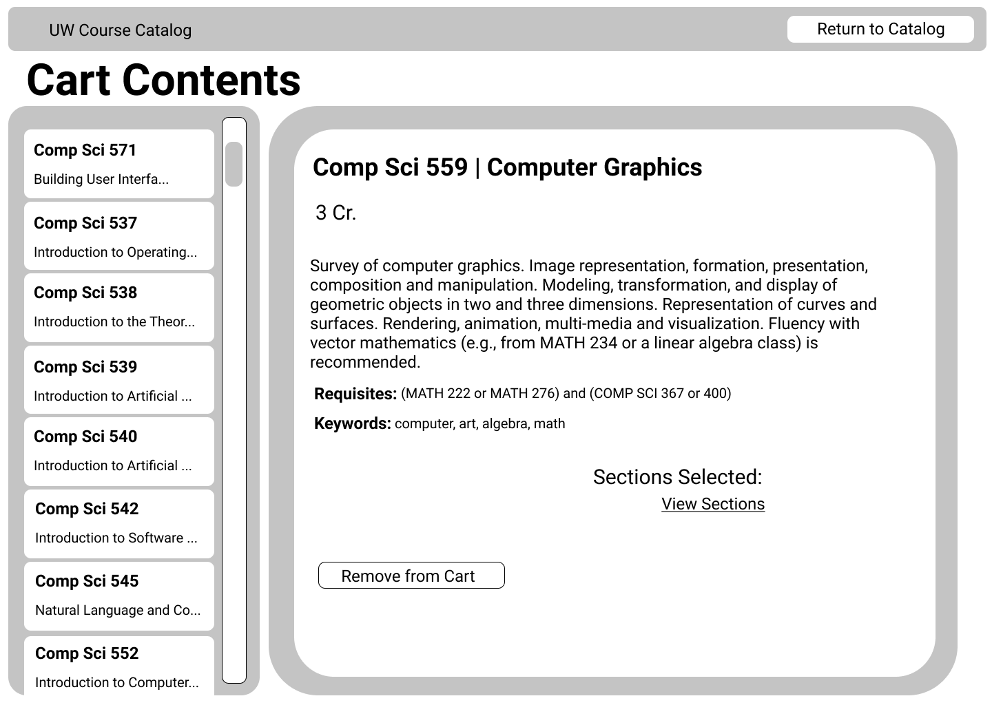
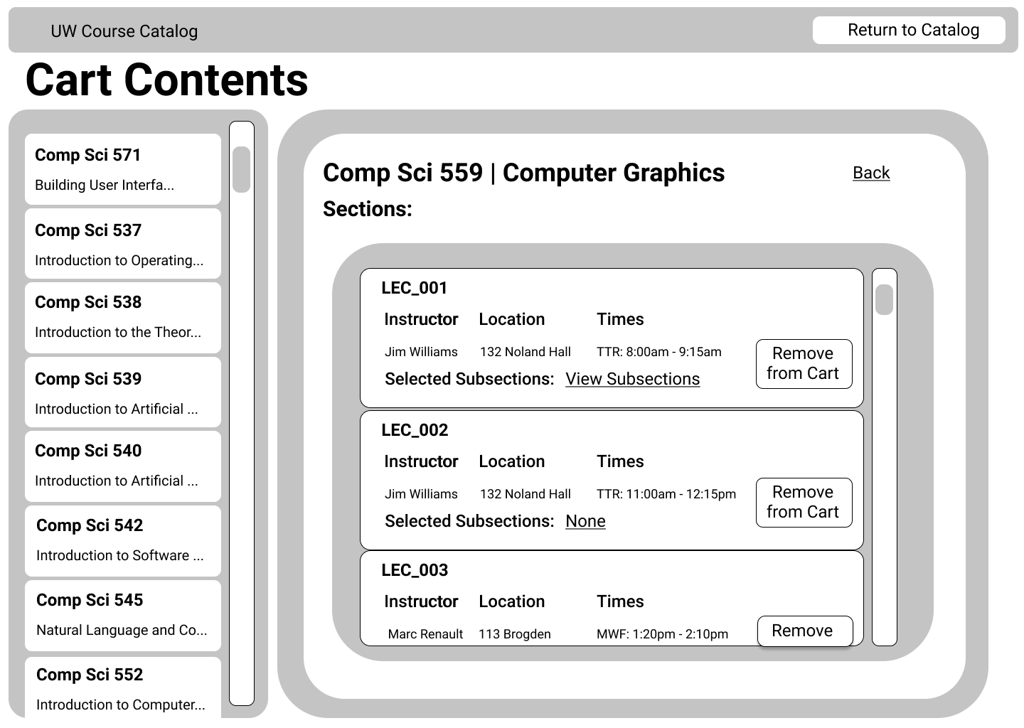
    Note: Due to the limited time available (as an implementation was going beyond assignment scope), a bug persisted in that sections/subsections for a course can't be viewed within the Cart.

Navigation Model: Stepwise

...

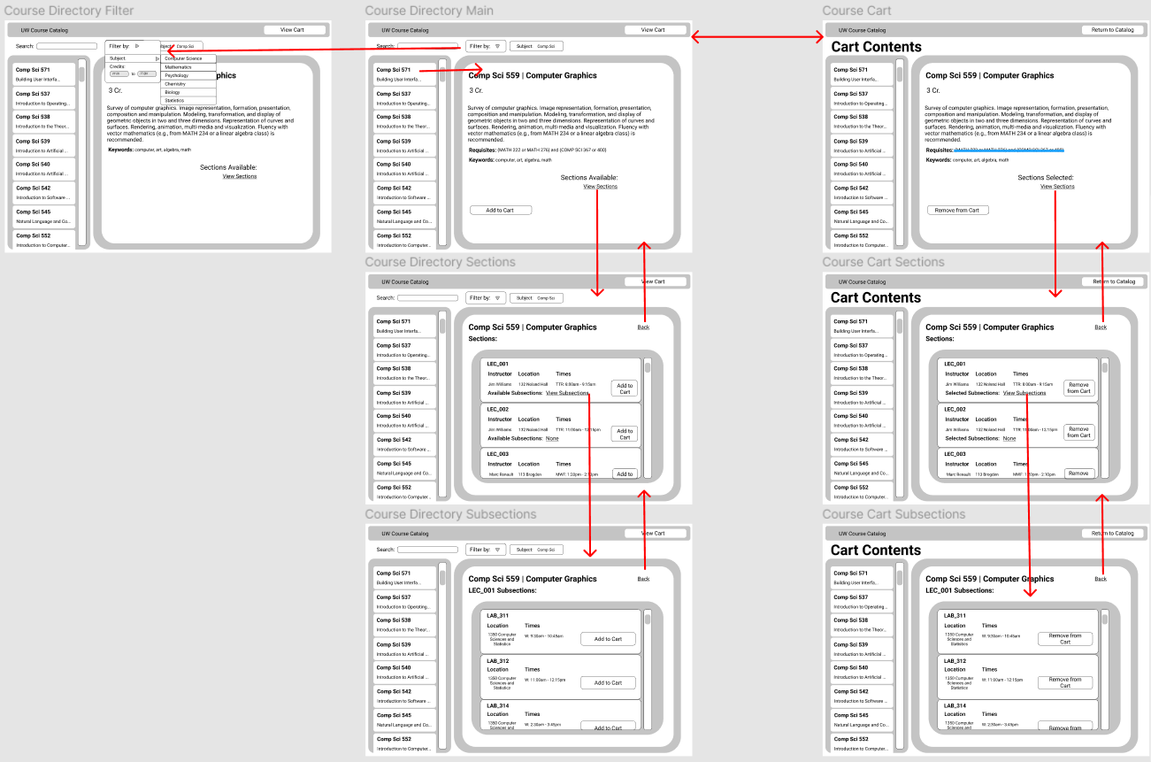
Wireframe Overview

...
Updated Navigation Model

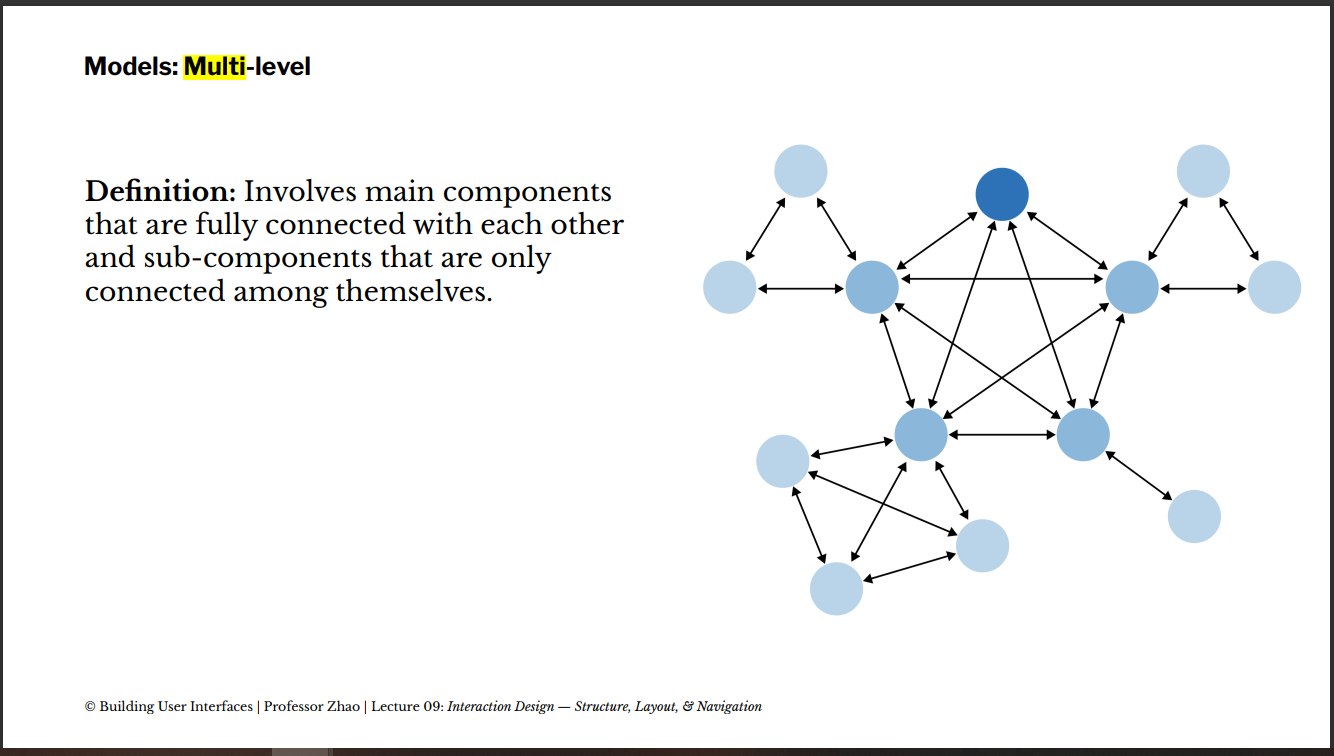
This model is more akin to a multi-level model (see image below), with Course Directory Main and Course Cart being the two fully connected components. They each have subcomponents only connected amongst themselves.

...

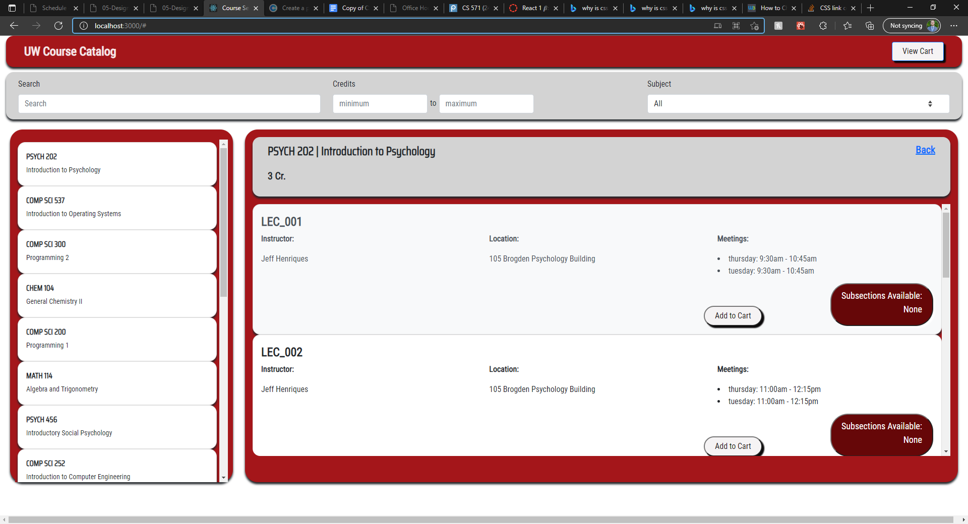
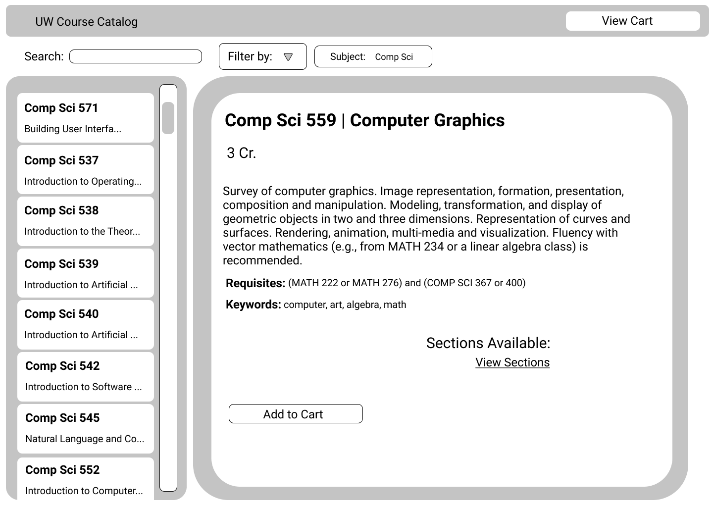
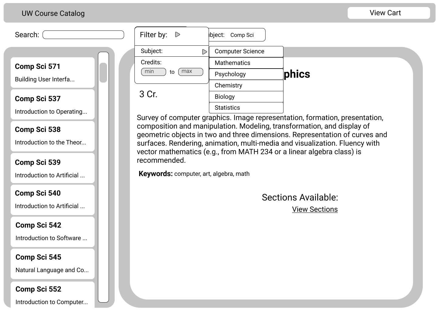
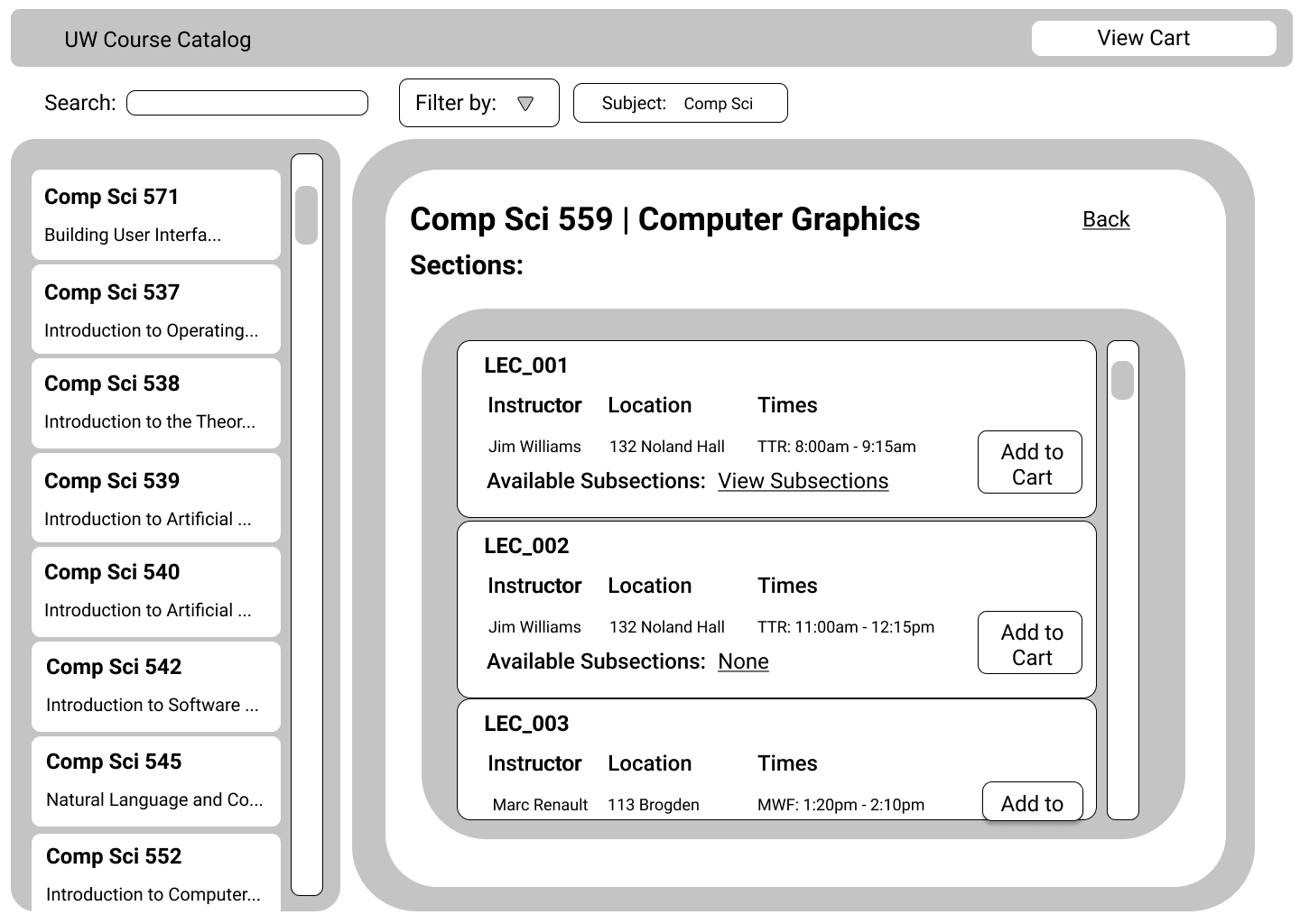
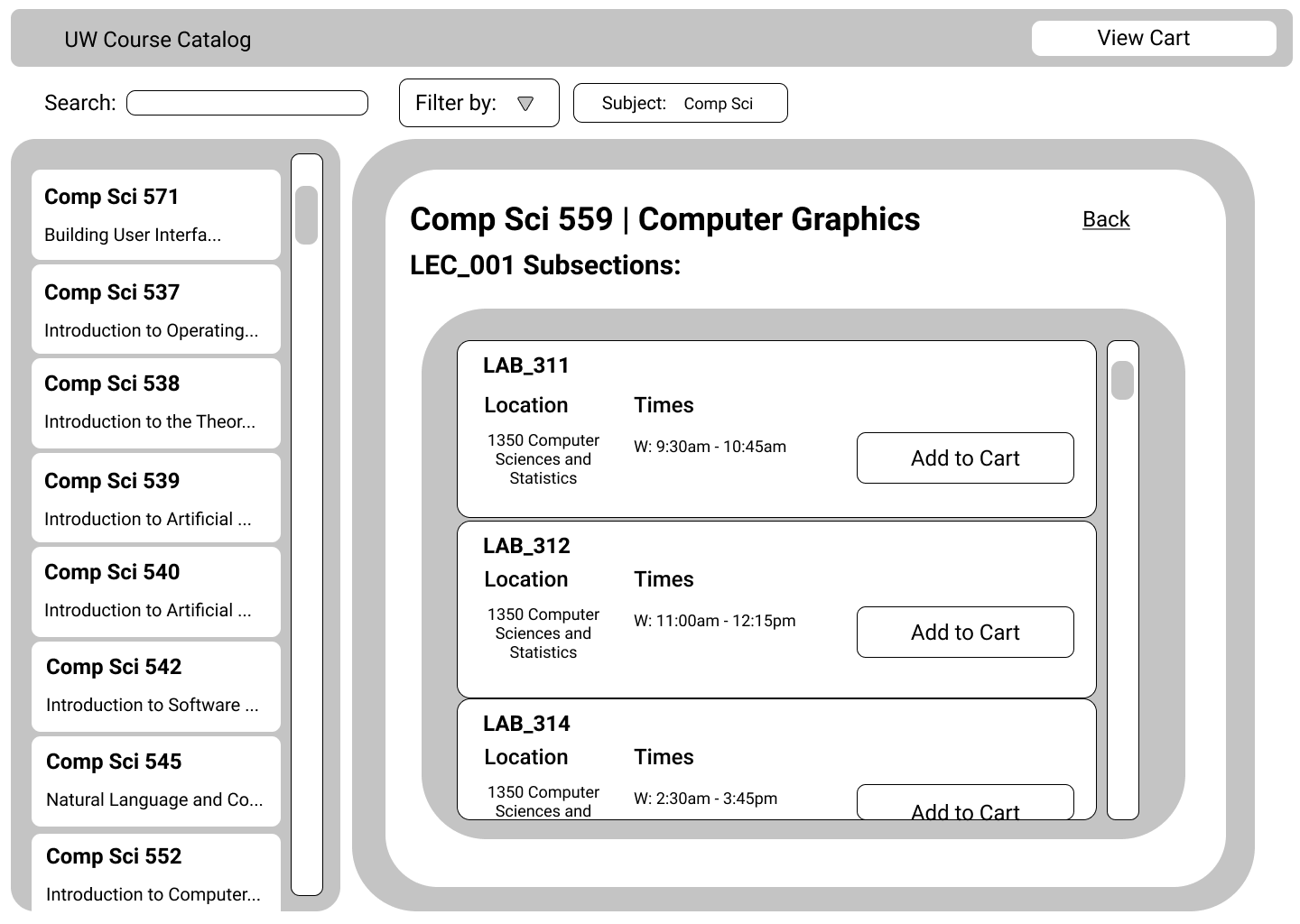
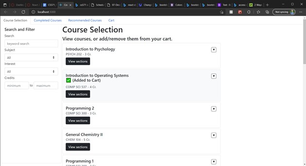
Course Directory Screen

...
Navigation Aid Added:

Sidebar for ease of navigation through a large list of courses, either in the directory or in your cart.

Layout Principle:

From eyeballing it, I'd hope the layout matches the golden rule. I've got an inverted L shape on the left side of the screen with a bit more sparsity on the bottom right.

I'm primarily using a grid, with three main rows: Header, Search, Content.

  • Two columns in the Header Row.
  • Three columns in the Search Row.
  • Two columns in the Content Row.


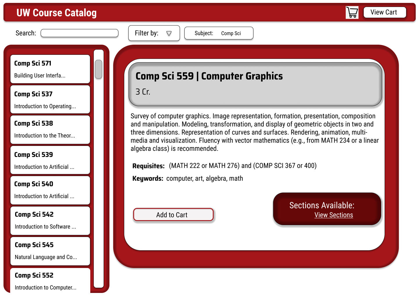
Redesign Detailed Mockup (FIGMA)

...

Fonts: Roboto Condensed (default), Saira SemiCondensed (bolded text).

The intent was to go with a font that felt a bit modern. I have some concerns about Saira SemiCondensed, as I'm afraid it seems too 'gimmicky', but a decision needed to be made. The Roboto family I'm fond of, though.

Colors: Coolors palette: FFFFFF, F5F3F4, D3D3D3, B1A7A6, E5383B, BA181B, A4161A, 660708, 161A1D, 0B090A.

Intent was to utilize the color palette of the school. There was a mistake, in that Add to Cart and View Cart are supposed to have the same fill color, whether it's the off-white of Add to Cart or the pure-white of View Cart.

Icons: I plan to make use of a cart icon in the upper right corner. Not sure what I'll use in the same place on the views from the Cart context to lead back to the catalog.

Size: Used to draw attention to different components. The primary column on the right has larger text than the list of cards on the left. The title of any component is larger than the body text, etc.

Redesign Overview

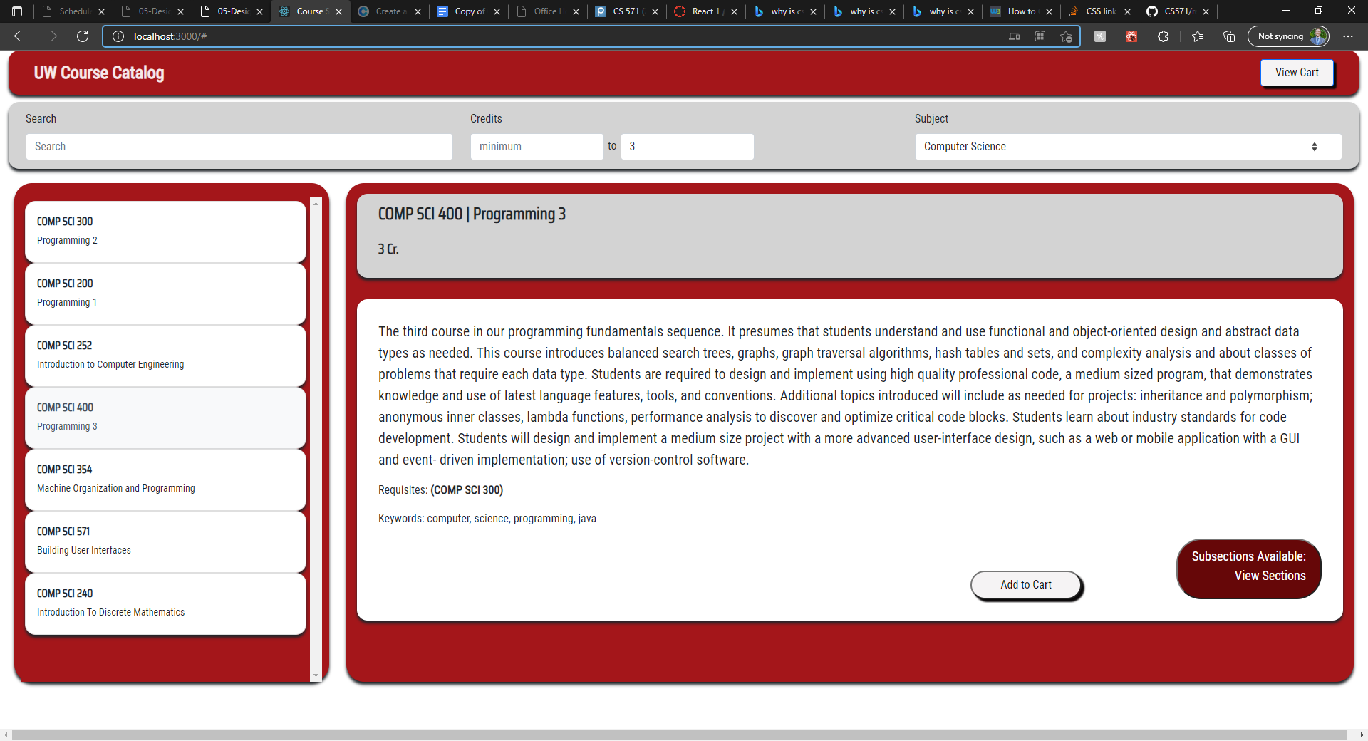
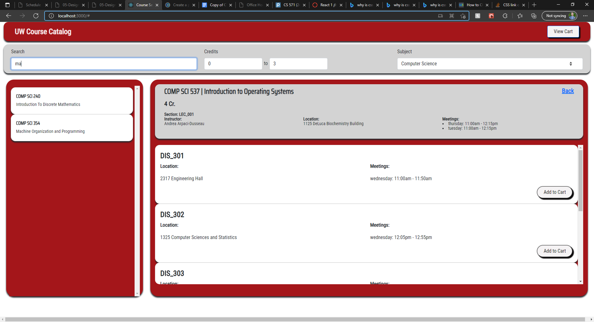
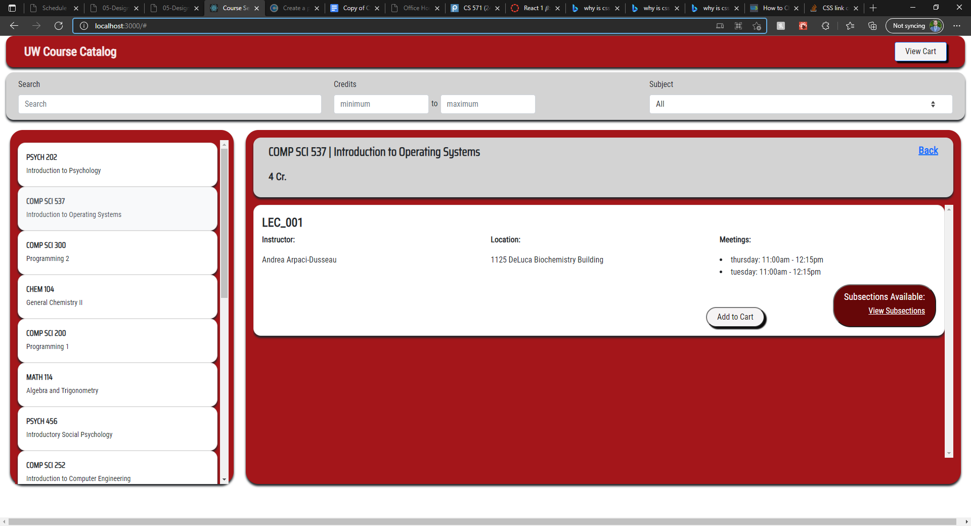
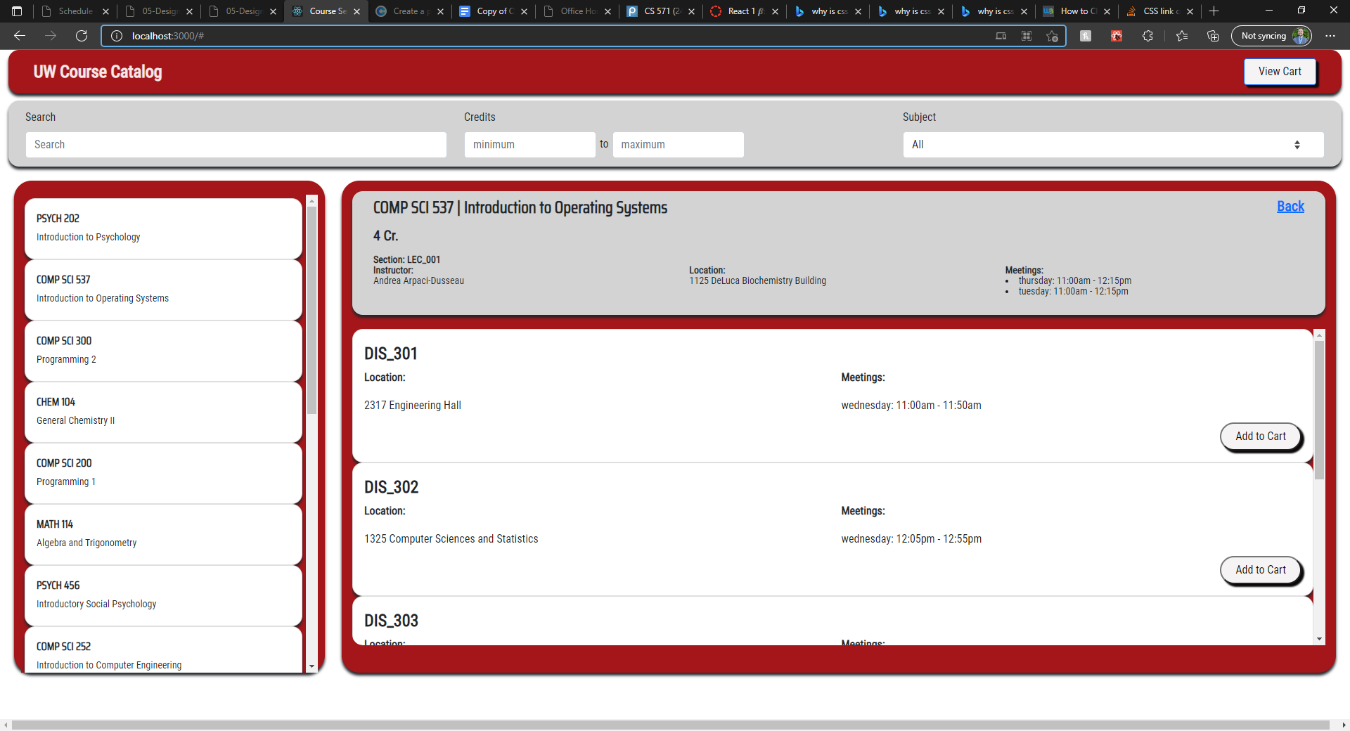
Demos: See demo video to watch a brief clip of the implementation, or go to the live demo to try it out yourself.

Redesign Summary: I was able to get a mostly-functional implementation of my redesign working. Viewing sections/subsections in the cart is the only thing that's broken as far as I'm aware. The assignment was only wanting a mockup, not a functional implementation, so I was working with limited time.


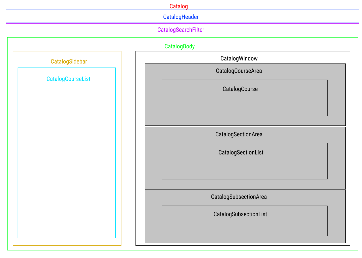
React Component Hierarchy

...

Week 03: Completed and Recommended Courses

Week 03: Completed and Recommended Courses

Live Demo / GitHub Repo

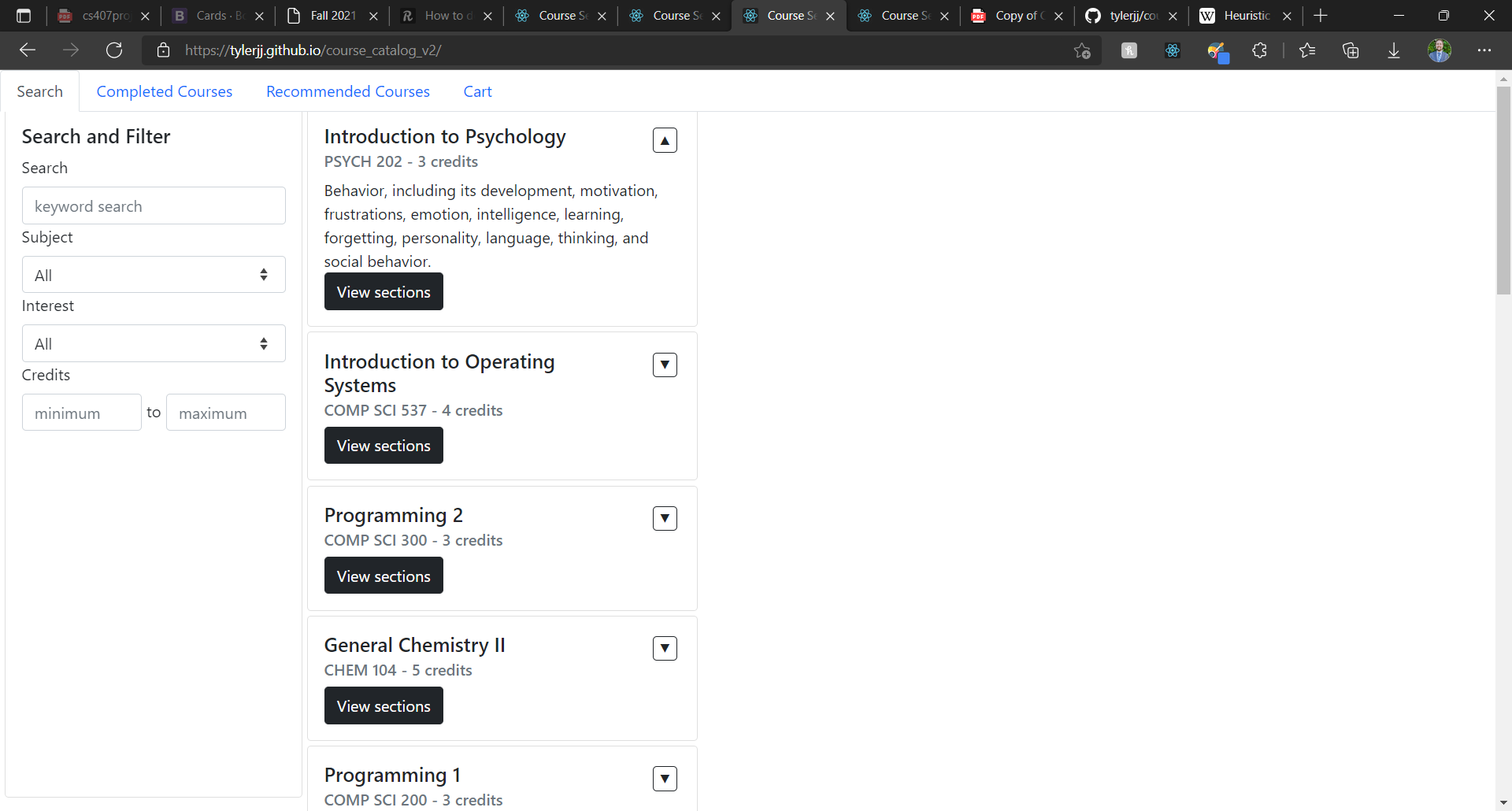
Completed and Recommended Courses

(Starter Code from TA Implementation of Week 01)

Overview

This assignment is meant to introduce features of React. This is the second functionality assignment in which the features of a course guide application are extended. This application uses a limited quantity of modified data from the UW-Madison course information database. With this assignment, the features of Course Enroll - Week 01 will be extended to create a course recommendation system.

This project is the first of a two part React project in which the course management application is extended. This application uses a limited quantity of modified data from the UW Madison course information database.

Features Implemented
  • Problem 1:
    1. Fetch data from server http://cs571.cs.wisc.edu:53706/api/react/students/5022025924/classes/completed. This data details which courses have already been completed.
    2. Create a new component to display a previously taken course. This component might look somewhat like the Course component, but it will be simpler and won’t have options to add the course to the cart. In addition, it should not display information regarding sections/subsections since they vary between semesters. (You may also reuse the Course component if you can satisfy the aforementioned requirements with conditional rendering. )
    3. Create a new component to hold the previously taken course components. Make this component accessible as a new tab in the app. (Refer to Problem 2 and Problem 4 for example visualizations)
  • Problem 2:
    1. Create a component for rating a specific course. For example, the sample implementation below created the rating component as a child of the completed course component.
    2. Allow the user to rate courses they have already completed.
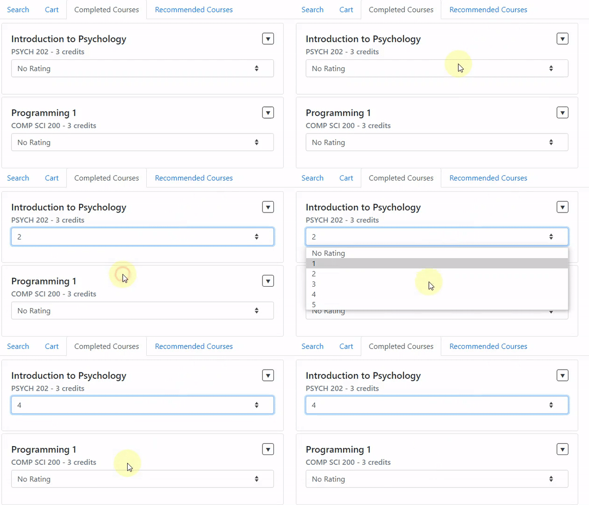
    3.  Problem 02 Visualization
  • Problem 3:
    1. Generate a list of interest areas based on the course data. Note that the interest areas should not be hard-coded but should be based on some values of the course data. For example, the sample implementation below dynamically generates interest areas using keywords from the courses.
    2. Create a component for the user to filter course results by interest area, using your list of interest areas. Make this component available to the user. The sample implementation put this component in the Sidebar Component.
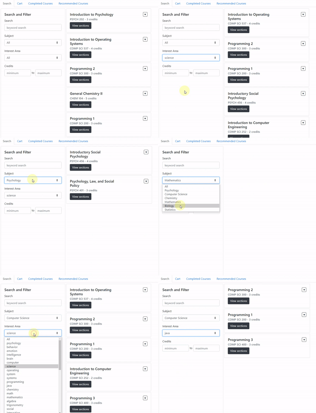
    3.  Problem 03 Visualization
  • Problem 4:
    1. Create your own recommender algorithm that takes in the rated courses and interest areas. Use the interest areas of rated courses to recommend courses which have not yet been taken in the interest areas of highly rated completed courses.
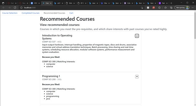
    2. Create a new tab which displays the recommended courses to the user. For instance, the sample implementation below shows several recommended courses in the interest areas of rated courses, sorted by the rating scores user gave for each interest area.

    3. Note: As long as your algorithm considers user's recommendation score and interest areas you defined in Problem 3, and does not include previously taken courses, the rest of the specifics is up to you.
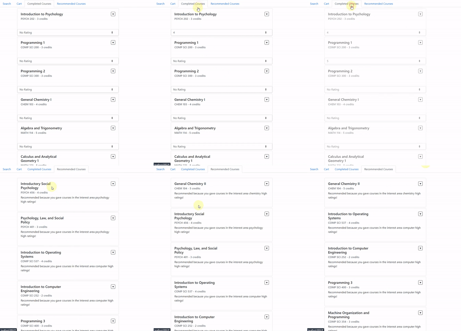
    4.  Problem 04 Visualization
  • Problem 5:
    1. When adding a course to the cart, design a way to let the user know if they are not able to take the course based off of the requisites and the user's previously taken courses. Even if a student does not meet the requisites to enroll in a course, they should still be able to add it to the cart.
    2. Anytime a course, section, or subsection is added, the user should be notified in some way if they don't meet a requisite. As long as you adhere to this basic requirement, the way to achieve this is completely up to you. (You may use one of the components from Bootstrap, or even a simple JavaScript function.)

This project was bootstrapped (by TAs) with Create React App

For more information, see a full writeup of assignment deliverables.
Week 04: Heuristic Evaluation, Recommendations, and Fixes

Week 04: Heuristic Evaluation, Recommendations, and Fixes

Live Demo / GitHub Repo

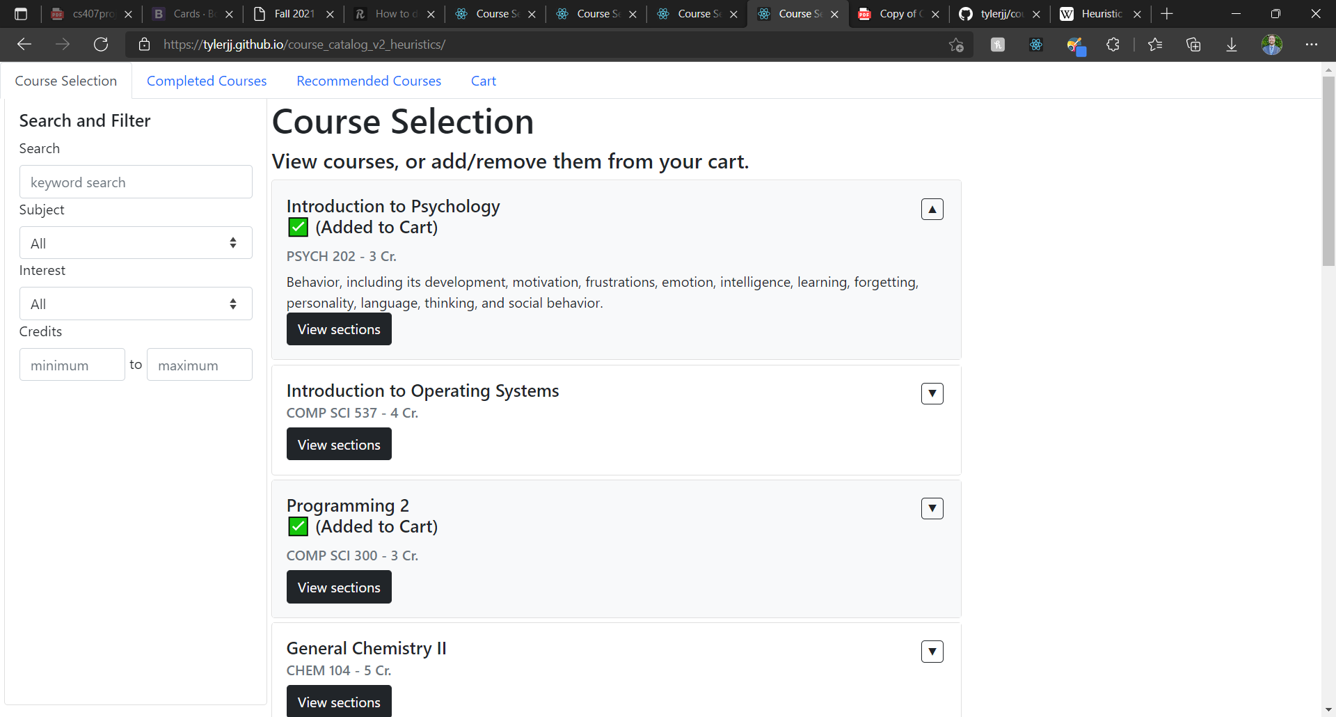
Note: When going to the live demo, click the top left tab to get started. The app launching without a tab in view was an oversight at the time of writing the program.

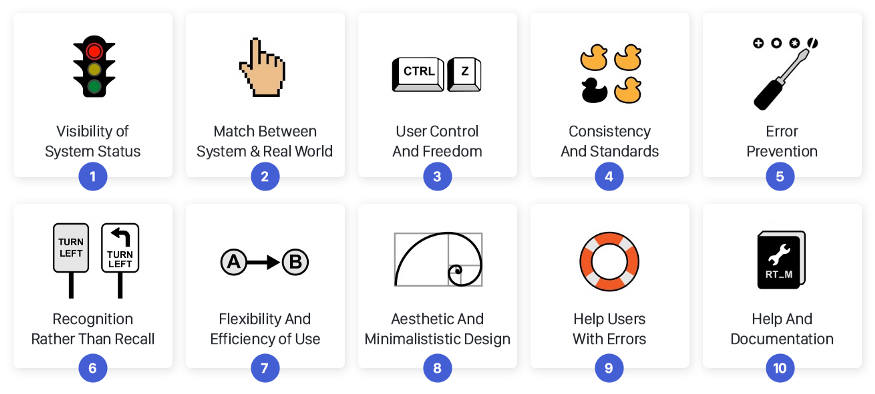
Heuristics Cheatsheet

...

Image Source: UX Collective

These heuristics are what we will be evaluating our components against.

Finding a Focus for Evaluation

In this step, the Week 03 Course Catalog iteration will be analyzed with the goal of finding 3-5 "components" that are highly consequential for user experience.

From the Assignment Specs: In real life, your application might have hundreds of components, screens, or pages, and you will have to focus your efforts on a limited set that will make the most difference in terms of effectiveness and user experience.

Relevant Views

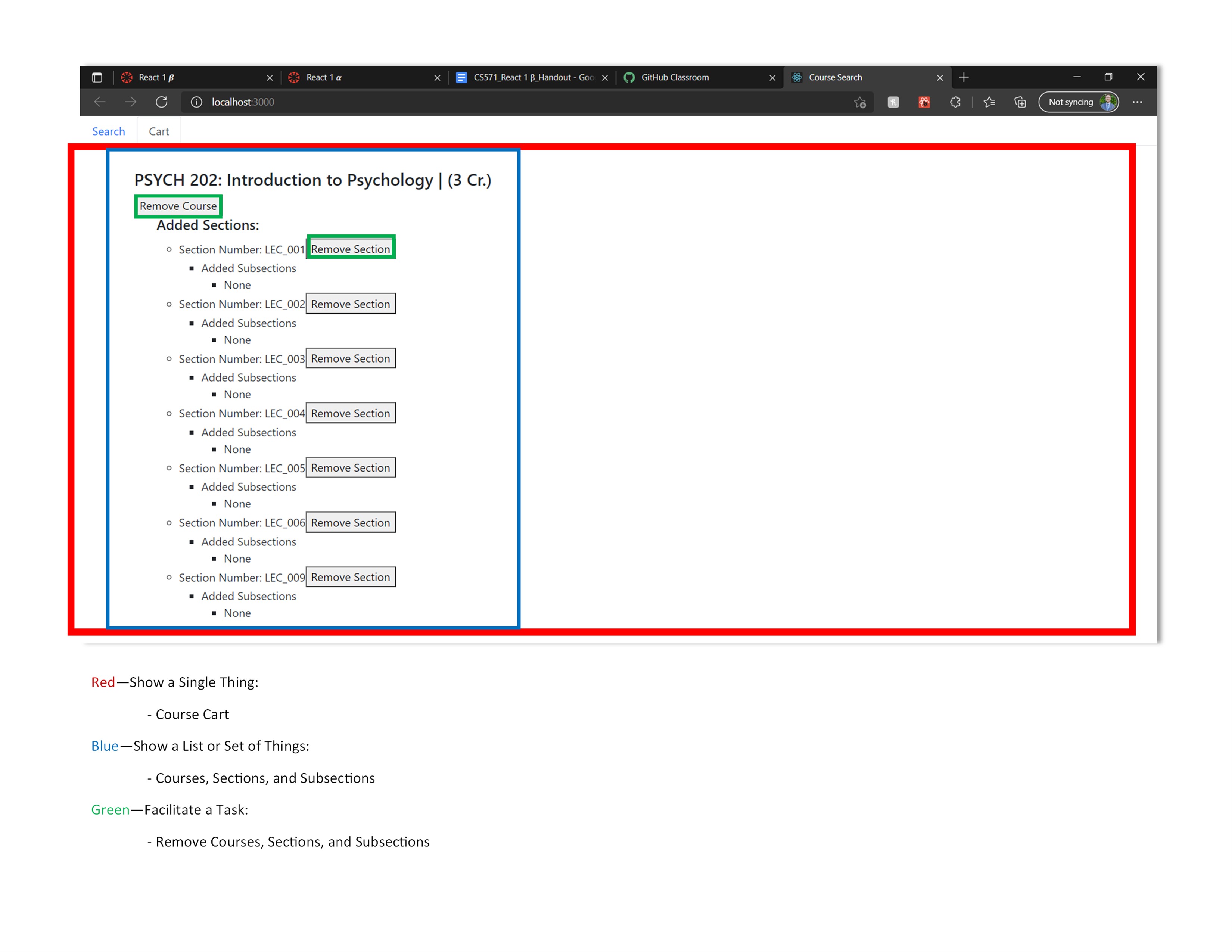
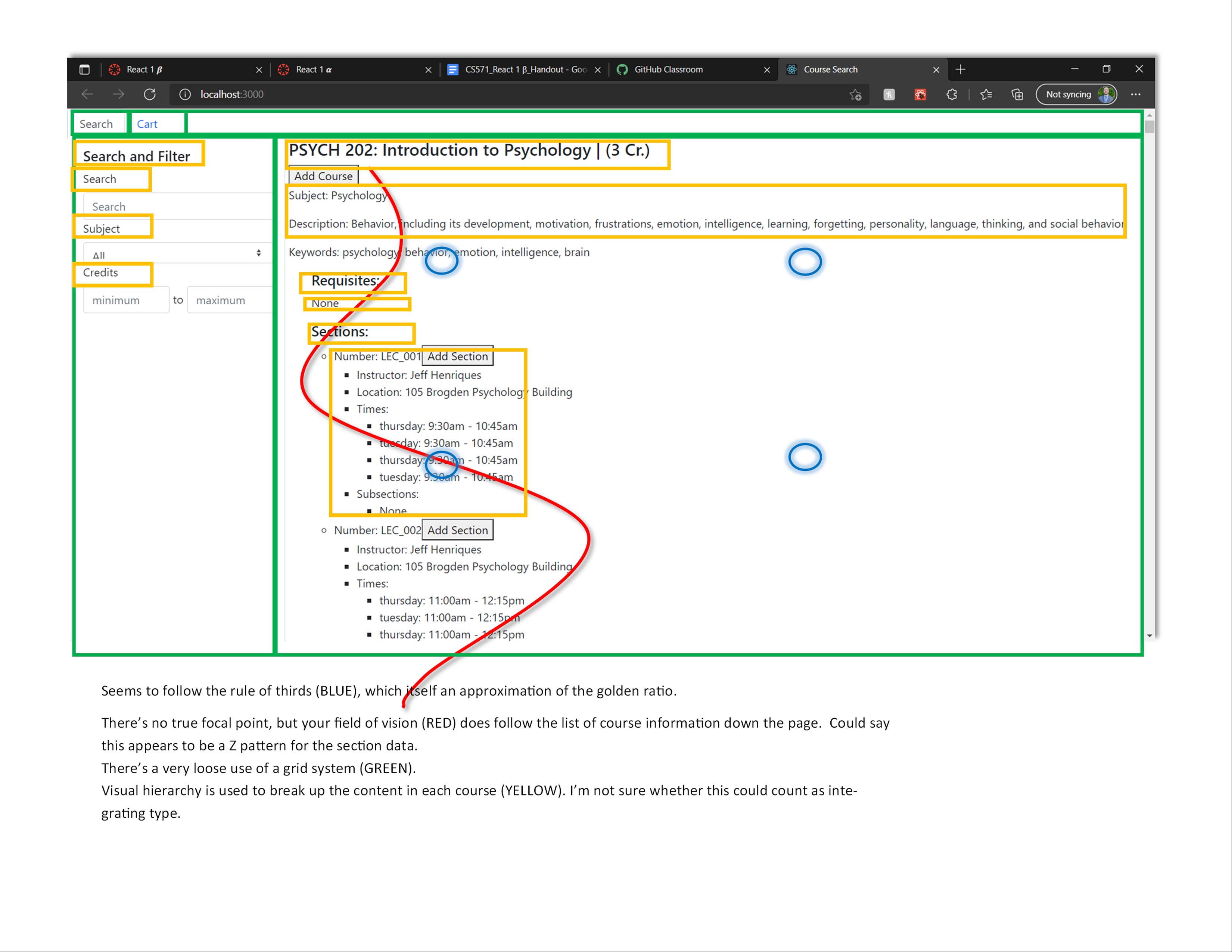
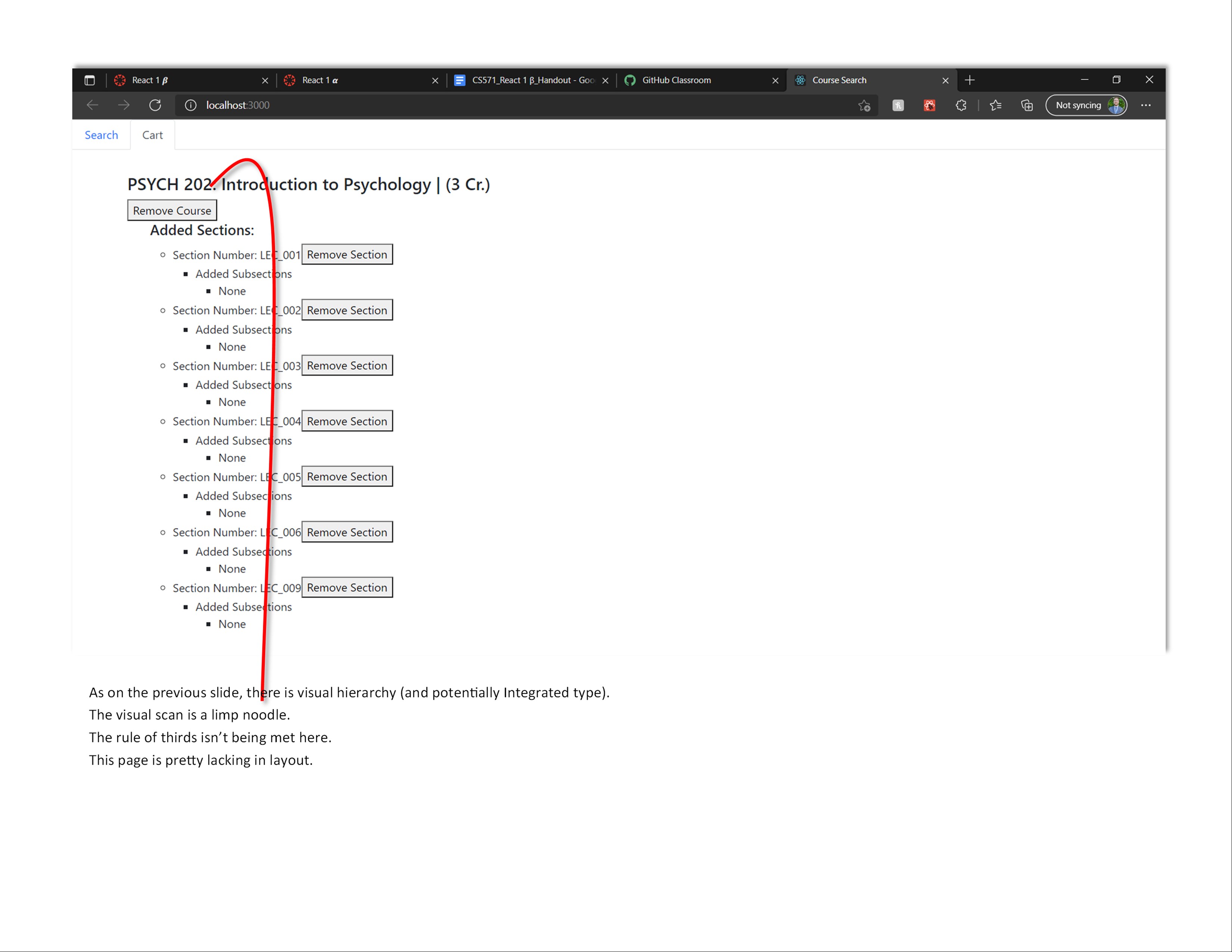
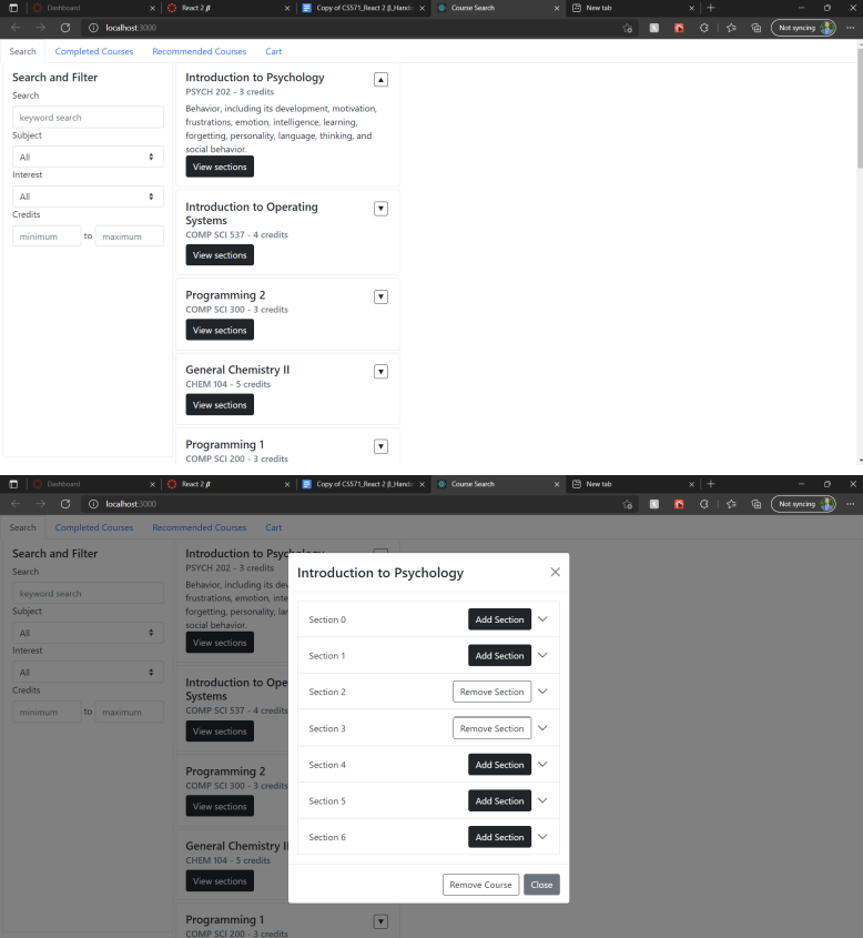
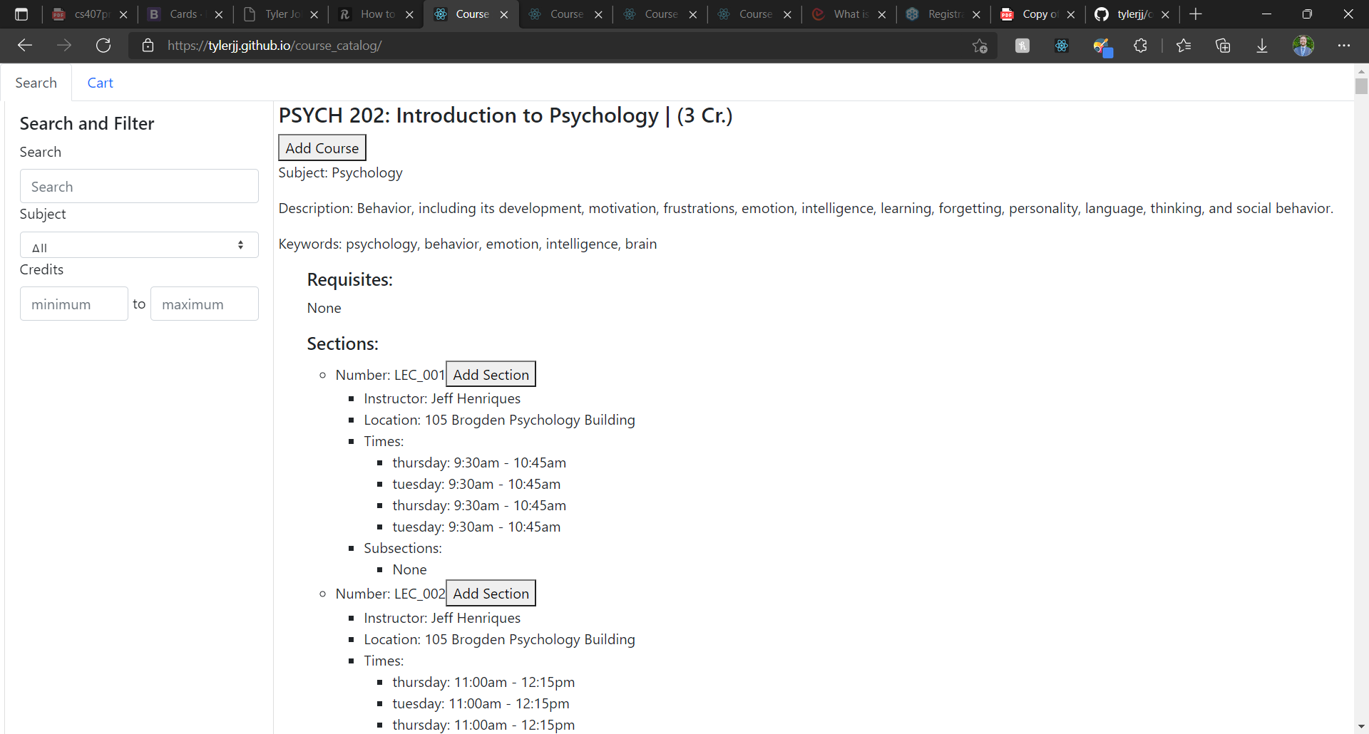
  1. Search Tab, Cart Tab
    ...

    React Component: Course

    Justification: These two views showcase the primary functionality of the course enrollment application. That primary functionality is built upon Course components.

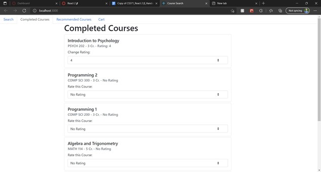
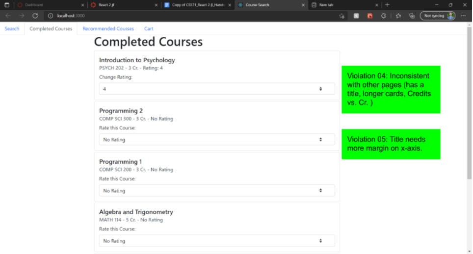
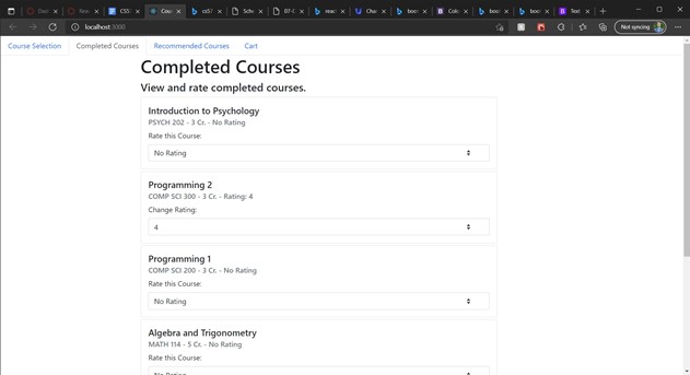
  2. Completed Courses Tab
    ...

    React Component: CompletedCourse

    Justification: Given that the Completed Courses Tab view is one of four views in our app, and that it's necessary in generating recommended courses, its building blocks (CompletedCourse components) are worth analyzing.

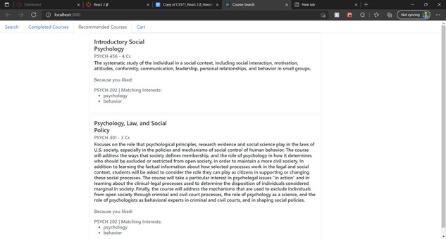
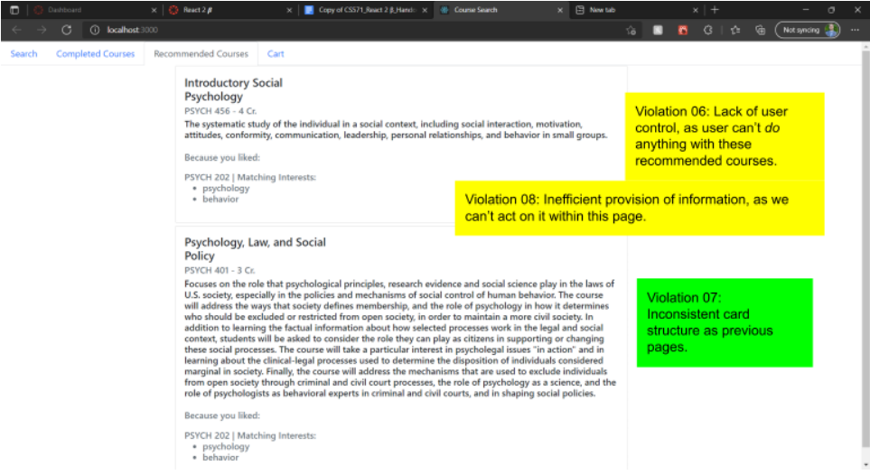
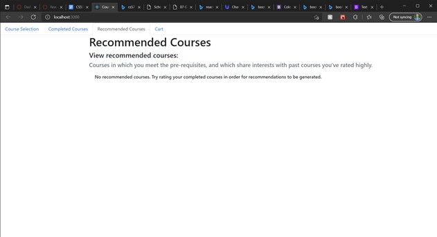
  3. Recommended Courses Tab
    ...

    Relevant Views: Recommended Courses Tab

    React Component: RecommendedCourse

    Justification: Given that the Recommended Courses Tab view is one of four views in our app, its building blocks (RecommendedCourse components) are worth analyzing.

Potential Violations of Heuristics

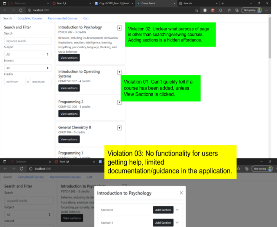
  • Violations 01-03
    ...
  • Violations 04-05
    ...

    Note: Violation 05 was poorly described at the time of this assignment. It can be either disregarded, or instead, let it represent minor styling issues.
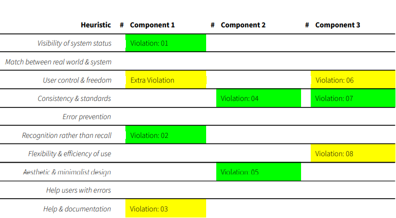
  • Violations 06-08
    ...
Violations Table

...